 Technologies and techniques that were prevalent in 2016, are going to have a strong influence in the design and patterns evolving in 2017. Since the web is an ever evolving space every trend that evolves have a very short duration time.
Down below we have listed 5 important designing trends we believe every designers should take advantage of in order to stay always ahead of the curve.
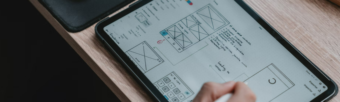
1.Mobile-First Approach
 Mobile first approach simply involves the process of designing for mobile or smallest devices first and then working up to the bigger ones. This approach to responsive design has shifted the paradigm of website user experiences.
Consumers who use their mobile devices for online shopping and social networking, always expect a new level of performance and function on their mobile devices as they find it harder to read in-depth content in smaller devices. This analysis compelled companies to put handheld devices at the forefront of both strategy and implementation. Designers also started to employ less screen real estate by introducing greater breadth to user experience with the use of more popular mobile features like touch and geolocation. Considering the fact that hierarchy of the content may change based on the constraints of the device, designers wireframe and prototypes vigorously before finalizing on a design.
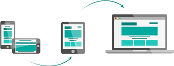
2.Responsive Design
With the advent of new devices with new capabilities and limitations and Google constantly updating its preferences about the way it looks at websites, responsive designs are now a part and parcel of web designing.
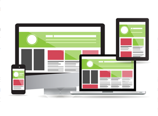 Responsive web design uses CSS media queries to create dynamic changes to the appearance of a website depending on the screen size and orientation of the device that is being used to view it. Responsive website enhances the overall user experiences. It makes the site easier to read and since it does not need any redirection of queries to certain URLs, it is actually faster than mobile sites. Additionally, Google suggest that mobile optimized responsive sites feature prominently in localized search results. Responsive sites are also cost effective because building a mobile application will be expensive whereas business will be paying only for a single site build to deliver content effectively across devices.
3.UI and Design framework
 Designers aims at making the web a user-friendly place with the use of tried-and-tested pattern. A common visual language that both designers and end users understand has paved the way for more and more UI and UX pattern to emerge across the web.
Material Design, Google’s visual language was rolled out across all of Google’s platforms, including Chrome OS and The Web to create a unified look that binds all of its product together. Google’s Material design is essentially a way of designing by creating a hierarchy of importance on the page. The brand incorporated material response with motion and made the transitions very intuitive. The responsive animations are inspired by how ink spreads on paper.
Designers are mostly looking for frameworks that has grid and card UI systems as cards can size and grids can restructure to fit any screen size. Bootstrap, Material- CSS, Foundation, Semantic UI and JavaScript MVC are few of their choice of framework to work on.
4.Typography
 Using eye catching typography is the latest trend with the designers as they believe it is an important visual medium. In 2017, we can see an increase in over-sized and full screen type which breaks the grid and image layering, working in tandem with parallax scrolling.
Bold and big typography can evoke emotion, create a brand’s personality and set a tone. Due to the shrinkage of visual span typography hierarchy has become very important in all design fields. Size and weight of the fonts can easily indicate which words or letters are important. Designers also use contrast between colors and images to create an impact.
5.Authentic Photography
As majority of websites look strikingly similar, standing out of competition has become more important than ever. Consumers wants to relate with the business or the company and when they visit the website to know more about the brand, they expect authentic information to be provided to them.
A wave of transformation can be perceived where we see slowly and steadily canned or stock photos are being replaced by bespoke photography. Brand and designers are conscious about the images they use on the website. Professional photographers are called upon to click pictures for the brands which are then being used across all channels. Thus, to produce more creative branded content and to become visually diverse, brands are heavily using authentic photography as a strong medium.
These are just to name a few. In the coming post we will show some interesting visual effects we believe are trending in 2017!
Till then stay hooked to our page!